I began by looking into existing leaflet folds and techniques on Behance and Pinterest for inspiration. I especially like this three-dimensional leaflet/poster below. The theme for the piece was to (re)discover the Public Library The logo has a three-dimensional feeling which is achieved through special folding techniques.
Below are examples of squared paper that folds out, an idea I want to carry out as I think concertina folds is an obvious choice for showing a design process.
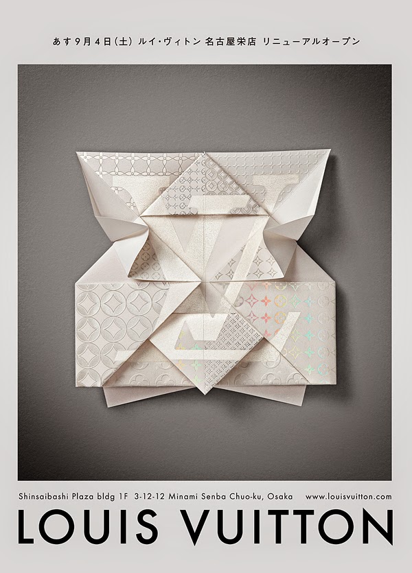
I especially like the Louis Vuitton invite below created by a studio called Happycentro in Verona. Their formula for beauty is mixing complexity, order and fatigue, the attention to detail is incredible with use of embossing and letterpress: "The starting idea was a paper object designed by us; its shape, expression of perpetual precision and pureness of the origami world, we wanted to meet with our intimate passion for special printing techniques."
Another idea to carry out, is cut into paper, so it could conceal/reveal part of my design process or something.


