Showing posts with label OUGD504. Show all posts

Thursday, 8 January 2015

OUGD504: Module Evaluation

This module has been incredibly beneficial to me, it has taught me about designing for web and the restrictions that come with that as well as designing for print and branding. Overall, the module has given greater deeper understanding of the design process.
I feel my time management and commitment to the course has developed, as well as my ability to quickly work up designs within a studio environment. I think this is because I am much more confident  with the adobe software, and I have stopped worrying about what anyone thinks. This first semester of study I feel I my idea generation processes has grown, creating insightful, and established responses/concepts to design challenges.


My first one week brief was to create a folded leaflet of our personal understanding of our design process. For the first couple of days I struggled with ideas and getting in to the swing being back in the studio. Especially after a few months of summer relaxing, it almost felt stressful. I attempted to design a folded leaflet that is considered and effective. Everything has been carefully arranged even though it is to look casual. I have designed and used vector illustrations to go on my leaflet which helps communicate my design process effectively. 

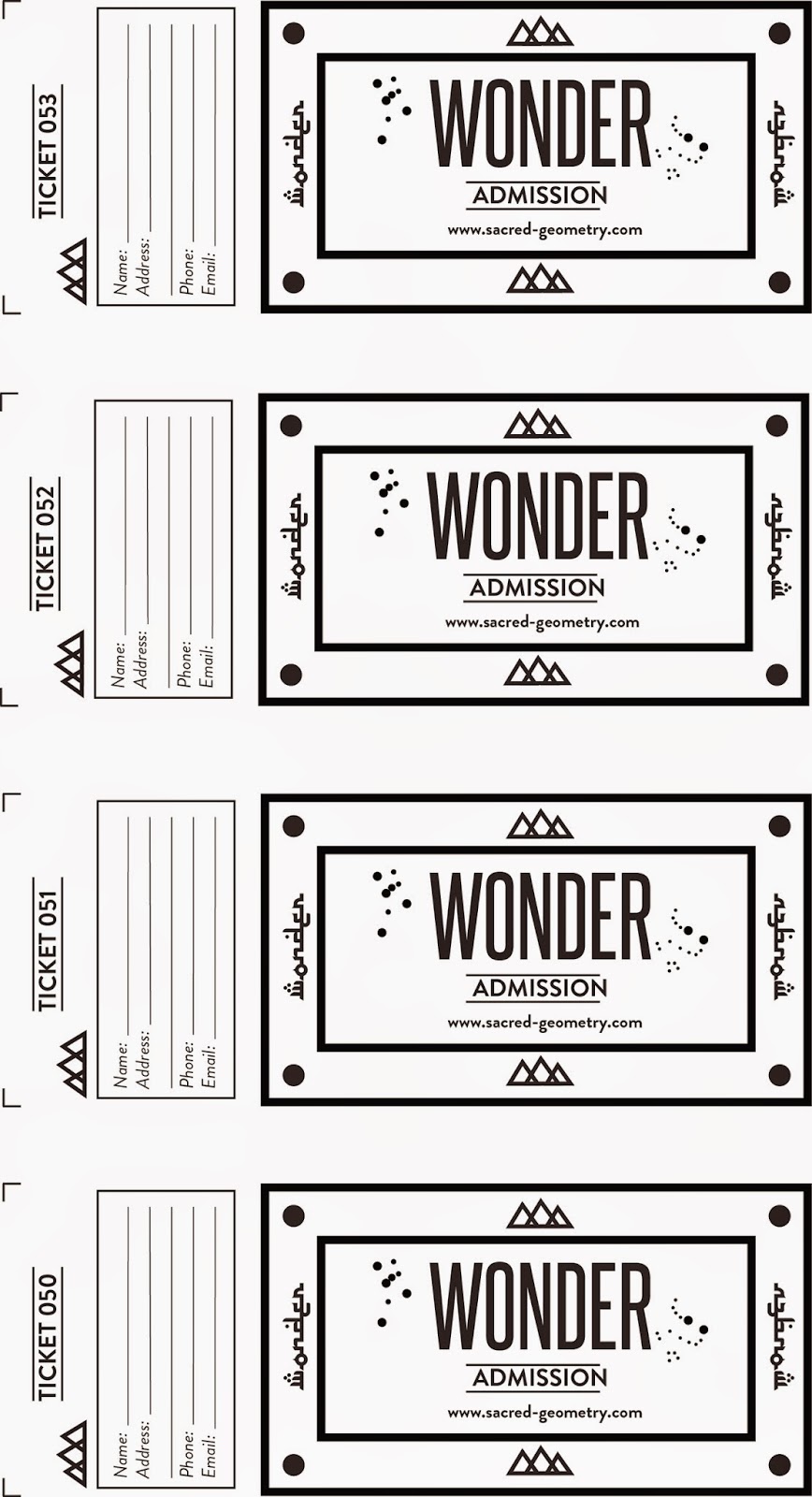
I struggled most with the web brief. The purpose of this brief was to design a multi-page website that effectively informs a user about the interesting and informative facts, figures, observations and visual content that you have discovered within the summer brief. Over summer I travelled to Hong Kong and was inspired by these sacred spaces I visited, which is why my website is based on Sacred Geometry and Architecture. Sacred Geometry involves a sacred universal patterns used in design of everything in our reality, most often seen in sacred architecture and art. The basic belief is that geometry and mathematical ratios, divine proportions (golden ration) etc. As a designer, I felt it was important to have an awareness and draw inspiration from ancient design.

To this day, I feel like I didn't showed my full potential with the web brief, I think this is due to the fact we were unable to code and make our websites live. This was due to circumstances out of my control. However, I did learn a lot about  about web safe colours and html & css, as well as the restrictions when designing for web. In the the future I would like to revisit/teach myself to code. 

Overall, I am pleased with my website, I have really enjoyed learning about the subject and design for web. Ancient design and civilisations have always interested in me. I think as a designer I think its really important to have an awareness of ancient design instead of only focusing on current design thats happened in the last century. 

Also, the way I approach a project has changed, I find I a lot efficient and quicker at making decisions. I have found that my final outcomes are a lot more conceptual than last year, especially when considering industry, culture and audience. I feel I design for the audience, instead of what I think looks good. I also consider media, format, methods and communication a lot more. 

I have started appreciating grids especially when designing for screen and print, I find they are a really useful tool, in creating visually pleasing design. 

The Augmented Reality brief. There were time limitations with this brief, as we only had a week to print our work when the print room was fully booked. However, I managed to get into drop in for digital print as well as screen-print. Giving myself a lot of work to do and trying to complete it as best as I can, it’s amazing what you can accomplish within a week by focusing and committing fully.

Overall, I have pleased how the module has gone, I feel I have developed a lot as a designer and I am looking forward to the rest of the year. 

Augmented Design: Evaluation

The aim of this brief was to produce a print-based advertising campaign across at least 3 print-based advertising deliverables (e.g. poster, flyer, billboard, etc.) to accompany my 'A brief history of...' website that features an element of interactivity. There are several methods, platforms and technologies available that can be exploited in providing interactive elements to print media therefore it is important that you research these thoroughly in order to develop an effective augmented design. Time management over the project.

To accompany my website I wanted to create an exhibition on sacred geometry to get people interacting with the exhibition and visiting/promoting the website. I wanted to promote sacred geometry and encouraging people to take a deeper interest in ancient design. I think this ties in nicely with my website as the purpose of it was to encourage people to take a greater interest in sacred geometry, ancient Egypt/orion mystery and more. I have taken aspects of my website, such as all the symbols and diagrams I have designed. However for my advertisements I want to introduce colours as my website is black and white. As my topic is rich in history and ancient, I want this to be reflected in my print and advertising by using gold screen-print. 


Overall, I am happy with the print deliverables I have created I think it looks professional, clean and minimal. I used a matt card to print the poster,leaflet and tickets on. This felt most appropriate for how they were going to be used, they needed to be sturdy but still flexible. The tickets have been perforated so that the stub would be torn off upon entry.

I am most happy with my a3 posters, I think they are eye-catching and different. I incorporated digital print with screen print over-layed I felt this gave it a really authentic touch and reflected the subject. 


I used Brandon Grotesque as my main font, it a really nice rounded typeface which carries distinctively soft curves that give it a sense of friendliness which is what I wanted in promoting an exhibition . 

Overall, I am please with how the project has gone I found my subject really interesting and saw it as a challenge. I think I have been successful in making this project augmented by creating an exhibition the public can interact with.

Wednesday, 7 January 2015

Augmented Design: Final Outcomes

Final Outcome

A5 Leaflet


Poster


Augmented Design: In context

To make my project more interactive, and to my promote my website. I will display my posters and leaflets around leeds, in bus stops, cafe, local newspaper etc. 


Monday, 5 January 2015

Augmented Design: Screen-Printing

This afternoon I went down to Rossington street to screen-print. I decided that I wanted to screen-print using metallic gold. I felt gold was an appropriate choice as Egypt is rich in history. 


Overall, I'm really happy with how the prints have turned out, I think it gives my poster and leaflet a real authentic touch.

Augmented Design: Final Poster

Final Poster


Above is my final poster for my exhibition.  The poster can be displayed around galleries and in magazines local to leeds. This morning, I got them digitally printed and they are now ready for the hieroglyphic (eye of horus) to be printed over the top. I also got the leaflet negatives ready for screen-printing this afternoon. I will be doing a two colour (black and gold) a5 leaflet. 


I had an idea that I might possibly screen-print the entire poster (although not really necessary) so I have been preparing my images for screen-print by changing it to half tone dots. 


half-tone dots


Monday, 29 December 2014

Augmented Design: Tickets

For one of my print variables, I've decided to release an opening night ticket. Expanding on my research, I have been drawing inspiration for my ticket design from Egyptian stamps. I really like the borders and colours. 


Design Decisions 

I used an arabic style font that reads English.


The free tickets can be picked up from leeds city museum on a first come first served for opening day. I have left a space for people to fill in their details, so they can receive email updates about the website and find out about similar events/exhibitions.


Augmented Design: Logo Development

I have established that my event promoting my website will be called Wonder. Wonder because it is linked to a feeling of amazement and admiration, caused by something beautiful, remarkable, or unfamiliar . Below, is my first mock-up of the logo. I asked peers what they thought of it. From the feedback the line across the title makes it hard to read. 

Mock up

Final Logo


Above is my final logo for the event I wanted to incorporate all the constellations relating to the pyramids at Giza; Orion, Sirus, Ursa Minor and Thuban. I feel this makes it more conceptual. Below is a vector diagram from my web brief which shows all the shafts that point out to these constellations, these shafts were seen as the Pharaohs gateway to the heavens. 


Sunday, 28 December 2014

Augmented Design: Design Decisions

Font Choice 


My chosen font is Brandon Grotesque, a sans serif type family of six weights with matching italics. It was designed by Hannes von Döhren in 2009/10. Influenced by the geometric-style sans serif faces that were popular during the 1920s and 30s, the fonts are based on geometric forms that have been optically corrected for better legibility which is important for my print campaign.

Brandon Grotesque has a functional look with a warm touch. While the thin and the black weights are great performers in display sizes the light, regular and medium weights are well suited to longer texts. The small x-height and the restrained forms lend it a distinctive elegance.


I felt this sans serif font choice fitted well with my project as it to geometric and it goes well with my existing website design.

Colour Choice

To keep in fitting with my website I will be sticking with black and white yet using gold screen-print over the top. I felt using gold makes my project a lot more conceptual as ancient Egyptians worshipped the sun and collected gold. Egyptologists tell us is the other 75% of antiquities and gold are still buried in the sands of Egypt. 

Thursday, 11 December 2014

Study Task 13: Print Finishes

Lamination


Production Method: Lamination adds a layer of protective coating (usually some type of plastic), often glossy or matte, to the printed surface while also improving its sturdiness and water resistance. Lamination also has the added benefits of improving the tactile feel of the of the printed surface, lending it a smooth finish. If a high gloss laminate is applied to the printed surface, photos and images appear to have more contrast and have better sharpness, as shown below:
Cost: Low 


Matte laminated prints are more subdued but add a very luxurious and elegant finish to the printed surface:


Spot UV Gloss/Varnish


Production Method: Spot UV varnishes are paper varnishes applied to the printing surface and is cured or hardened by UV light during the printing process. This results in a glossy coating on the surface of a print.
Digital Preparation: 
Cost:  High. As the application can add one or two working days onto the turnaround time. This is simply because each piece of the printed design must individually passed through the spot gloss machine. This is labor intensive and a very specialised process which is why the cost does ramp up quite a bit.

(theres gloss, matte, satin, silk and neutral finished to varnish) 


Foil Stamping


Production Method: Foil stamping is the use of a malleable metallic material applied to the print surface by using heat and pressure. It adds reflective elements to the design as well as luxury. 
Digital Preparation: 
Cost: High. As it is labor intensive


Embossing

Production Method: Embossing refers to raising parts of the page for emphasis and texture.Embossing also adds a tactile dimension to your design. Images and text are literally felt.Often, embossing can be combined with other printing techniques such as foil stamping to enhance the effects of both techniques. Embossing happens after laminating, foiling, varnish etc. 
Digital Preparation: 
Cost: Low. Not as expensive as you might think. 


Letterpress or Debossing 

Production Method: Letterpress was invented in the 15th century and was the first reliable and widely used method of printing. A worker composes and locks movable type into the bed of a press, inks it, and presses paper against it to transfer the ink from the type which creates an impression on the paper.
Digital Preparation: None
Cost: Medium. Labour intensive. 


Die Cutting 

Production Method: Die cutting is used for creating shapes or slits in printed items, eg. if you wish to create a circular invite, innovative mailing piece or slits to hold a business card then you will need to have your finished piece die cut.


Thermography 

Production Method: Thermography is also the name of a post print process that is achieved today using traditional printing methods coupled with thermography machines. Thermography machines consist of three sections with a through conveyor.

The first section applies thermographic/embossing powder, made from plastic resins, to the substrate (normally paper). The areas selected for raised printing are printed with slow-drying inks that do not contain dryers or hardeners so that they remain wet during the application of powder. This ink is dried and hardened later during the heating process.

The second section of the process is a vacuum system that removes excess powder from uninked areas of the substrate.

The third section of the process conveys the product through a radiant oven where it is exposed to high temperatures. The heating process takes on the order of 2.5 to 3 seconds. The substrate (usually paper) has a peak in IR absorption at the wavelength used. Through conduction from the paper, the powder temperature rapidly increases and starts melting. When the process is correctly adjusted, the center of the largest filmed areas reach sufficient quality level as the product exits the heater. The melted ink then solidifies as the product cools.

This process is sometimes produced using manual powdering. The substrate with the wet ink is dipped into the powdered polymer. The sheet is then tilted back and forth, rolling the powder across the image. The excess powder is then removed by raising the substrate to a vertical position and lightly tapping the back side. The powdered sheet is then fed into a radiant heating system (as above) at a speed that achieves a good-quality melted film. In the case of craft applications, the powder is melted using a heat gun that blows hot air.

It is commonly used on wedding invitations, letterheads, business cards, greetings cards, gift wrap, packaging and can also be used to print braille text. It is sometimes used in diploma printing as an attractive alternative to the more expensive engraving option.


Perforating 


Production Method: Perforations allow a document to be separated into smaller portions of the whole and they allow a document to be folded easily (similar to the function of a score). In terms of printing specifications, perforations are classified according to bursting strength or tpi, which refers to "ties per inch" or "teeth per inch."
Burst and Tear Strength
The burst strength is a measurement of the pressure (as measured with a burst strength gauge) that is required separate a document at the perforated location(s).

The tear strength is the resistance that a perforation offers in preventing a document from separating at the perforated location(s). This also correlates with the physical effort that is necessary to separate the document at the perforated location(s).Tear strength can be categorized as "light release," which is easily torn; "medium release," which provides moderate tear resistance; or "stiff release," which provides the greatest resistance to detachment even after the document is folded at the perforation and is subjected to rough handling.The purpose and function of a perforation often determines whether the perforation is to be an easy release variety (3 to 6 TPI) or a stiff release variety (10 to 18 TPI). The weight and thickness of the paper stock also affects the burst strength.


Saturday, 6 December 2014

Study Task 12 - Augmented: Critical Questions.

Layar App

Layar is a company that believe augmented reality has the power to effect change in the way people discover and interact with useful and educational information. They gained international attention as one of the first mobile augmented reality browsers to hit the market. 


This Layar creator really isn't for me, I mean the whole point of buying a magazine is to have, hold and read the magazine not to end up browsing the internet. To me reading a book/magazine is a nice break away from technology. 

QR codes

QR code stands for Quick Response code. QR codes are like 2-dimensional barcodes, somewhat like the barcodes scanned during checkout at a grocery store. Scanning a QR code with a QR reader app on a mobile device can trigger things to happen on the device, such as launching a web browser and opening a webpage, or downloading an online file etc etc. 

Personally I have never bothered scanning a QR code and I'm pretty sure 99% don't bother with them. However, some people may find them super useful...


Questions! 

What is the potential of interactivity in print?
The goals and potential of interactive advertising are usually akin to the traditional objectives of advertising, i.e. to sell a product. This in turn means that many of the traditional elements of advertising impact and effectiveness remain relevant, even within the scope of interactive media

Can augmented design help draw people to your website?
Yes if used appropriately without trying too hard/gimmicky etc.

Is it all just a bit gimmicky? Or, are there opportunities?
Augmented design is definitely has the potential to be gimmicky, sometimes ruining the design of a piece altogether. I find the Layar app is just trying a little bit too hard to be different. When I see a QR code I never bother scanning it, and I'm sure 99% of other people don't bother either.

What kind of interactivity would be effective for my campaign?
As I am promoting exhibition. I want people to get inspired and to create excitement about learning about the endless mysteries surrounding Egypt along with its puzzling unexplainable theories of the great pyramids, built around the alignment of pyramids and stars, with its structural nature and lines. Some initial ideas I have are, posters, flyers, badges, bookmarks, etc.

Wednesday, 3 December 2014

Workshop: Preparing images for print (Photoshop)

Tab tells you what colour mode you're working in.
All designed to work in RGB, default. 
-Colour Spectrum-
Mode of image should be in RGB, if you change it to CMYK there is a shift in colour (nearest printable colour)

Gamet Warning - silver areas colours are outside CMYK mode


Adjusting the Levels


Hue/Saturation


Proof Colours - The ∆ and exclamation mark shows that it is not a print colour. The cube shows it is not web safe. You can click on them and it will go to the closest colour.


Spot Colour

In offset printing, a spot colour is any colour generated by an ink (pure or mixed) that is printed using a single run. The widespread offset-printing process is composed of four spot colours: Cyan, Magenta, Yellow, and Key (black) commonly referred to as CMYK.

economic factors - cheaper

you can use spot colours to print metallic, fluorescent, varnish colours

Colour Libraries 


The main use of photoshop channels is to store information about colour. Below I have done some experimentation with adjusting them.