Sunday, 30 November 2014

Augmented Design Research

Ikea Catalogue 

One example of augmented design that I really liked and felt had a good use and not a just pointless edition was the 2013 Ikea Catalog App idea, basically it helped the catalog show different product and ranges that print just couldn't. However, my project is different I am not selling anything and I am holding an event. 


dumb ways to die 


Scratch Cards


I found this on pinterest, I don't know whether this would come in useful but I like this scratch card element. It could make the print a lot more augmented/interactive with a scratch card element . I found this link to make your own DIY scratch off card. As my event will be egypt related gold would work really well. 


When you load the app, holding it flat, all lines of the New York subway are displayed in coloured arrows. By tilting the phone upwards, you will see the nearest stations: what direction they are in relation to your location, how many miles away they are and what lines they are on. If you continue to tilt the phone upwards, you will see stations further away, as stacked icons. Only available to Apple iPhone 3GS users.

Friday, 28 November 2014

Photography Workshop

This morning we had a photography workshop where we learnt how to photograph our work to a professional standard. It was good to refresh on how to use the cameras correctly and how to set up a shoot. We worked with continuous lighting, setting up small shoots and practicing getting the effect we wanted. 


Thursday, 27 November 2014

Augmented Design//looking at existing exhibition posters

I began by looking at existing exhibition posters and leaflets for inspiration for my event promoting a week long event on the sacred geometry of Giza Necropolis with talks on the orion constellation


Really simple. However, I want to make the most of the symbols (such as the one below) I created. 


I especially like the poster above, its simplistic and minimal. The detailed illustration of a fish with a geometric symbol of the fish mirrored below it .  I could do something like this relating to my website as it is on geometry and I have created a lot of symbols. I like the Chinese symbols laid over the image, I could perhaps do something similar by screen-printing hieroglyphics over the top. 

Wednesday, 26 November 2014

Augmented Design Analysis of Print Based Advertising

I began collecting interesting poster designs I like from Pinterest. I want to manage a merge of good conceptual content and an inventive format that makes the best of the print outcomes.

Coca-Cola Light


It's an old advert but still successful. Very different method they've used in this advertisement campaign. I love the way they've made the coke shoot up instead of in the glass to show how light the drink is. The openness of the visual joke makes it very warm in tone of voice and cheery and in keeping with the established identity of the Coca-Cola brand.


Game of Thrones

Possibly my favourite advert ever seen in New York Times, probably because I am a fan of Game of Thrones. The full page shadow of a dragon overhead, cast over a series of dummy articles. It creates fantasy and excitement. Brilliant marketing. 


Nivea Night Cream Poster

A really clever subtle poster for Nivea night cream. How they conceptualized this print ad with the moon representing the “night” cream is clever. Personally, I like its simplicity and straightforwardness.

Oreo 


Studio Task 10 - Advertising Considerations

Endless mysteries surrounds Egypt along with its puzzling unexplainable theories of the great pyramids, built around the alignment of pyramids and stars, with its structural nature and lines.

For the practical printed advertisement of my website, I think I want to go down the theme of promoting sacred geometry and encouraging people to take an interest in ancient design. I think this ties in nicely with my website as the purpose of it was to encourage people to take a greater interest in sacred geometry, ancient Egypt/orion mystery and more. I can take aspects of my website, such as all the symbols and diagrams I have designed. However for my advertisements I want to introduce colours as my website is black and white. As my topic is rich in history and ancient, I want this to be reflected in my print and advertising (perhaps using screen print and metallic inks)

I am already thinking about what three print deliverables could be:
Poster - Promoting the event and website 
FlyersPromoting the event and website 
Ticket - I had an idea people would arrive at the event with an e-ticket and leave with a well printed ticket that they could keep
Publication - Creating a small publication on the Sacred Geometry of Giza Necropolis 
Stamps - Creating laser cut stamps of hieroglyphics 

Before I begin to research or designing I want to identify and define the criteria which will shape my outcome:

Audience

The audience will be similar to the website no age range, it will be aimed at people who want to learn about sacred geometry and the orion constellation.

Message

I want to promote a week long event on the sacred geometry of giza necropolis (Giza Necropolis is the sacred space where the pyramids are) at leeds museum which will be relevant in promoting my website for more information or tickets to the event. At the event adults and children can unlock/discover the mysteries of Egypt and learn about sacred geometry. However, at the core it needs to promote the website. 

Tone of Voice
It will have to be formal yet interesting and educational

Design Boards


Studio Brief 04 - Augmented Design

Your task is to produce a print-based advertising campaign across at least 3 print-based advertising deliverables (e.g. poster, flyer, billboard, etc.) to accompany your 'A brief history of...' website that features an (or some) element(s) of digital interactivity. There are several methods, platforms and technologies available that can be exploited in providing interactive elements to print media therefore it is important that you research these thoroughly in order to develop an effective augmented design. 

In order to produce an effective advertisement you must consider carefully factors such as:

  • audience 
  • communication 
  • distribution 
  • content 
  • materials 
  • quantity 
  • time-frame 
  • printing method and cost 
During the planning stages of this project you will show that you have considered each of these factors through a project rationale.

Your advertisements will be print-based with your deliverable outcomes printed to a high standard. It is expected that you are to adequately prepare your design work for a commercial print eventuality - this process should be documented on your Blog.

My first initial thoughts about this brief is that I want to promote a week long event on the sacred geometry of giza necropolis at leeds museum (obviously, it wouldn't actually happen) Where adults and children can unlock/discover the mysteries of Egypt. Therefore, my ad campaign would be creating posters and flyers promoting the event at Leeds Museum. I could also have fun with colour and vectors (screen print?) I want to take this brief further than the website which is an outline of sacred geometry and the orion constellation. 

Some possible topic areas I'm thinking of: 
Gods of the Niles 
Secrets of the Sphinx 
Orion Constellations
Hook and Eye

Something I really wanted to create a small printed publication on this as well, as I'm really interested in the topic of ancient design and civilisations. This is something I could potentially work on over christmas. 

Monday, 24 November 2014

OUGD503: Sela Bar

I have decided to enter a submission for the Leeds College of Art Nest magazine to design an advert for the Sela Bar, a music and pizza bar in Leeds. 


I started by looking at few of their existing designs that they have on their twitter and Facebook. 


They are all bright, have use of bold type and quite illustrative. On my poster I would like to include the four main facts that it is a pizza bar, live music, beer and cocktails as I think these are the four things they aim for. I also want to create something quite different, almost psychedelic. 

Outcomes:


Final Poster:


Evaluation: 
I decided to respond to this brief to design an advert for Sela Bar as a chance to be featured in the next NEST magazine, Leeds College of Arts student magazine featuring students work that will get distributed around Leeds. I decided to do this as I enjoy creating posters and adverts and I wanted to create something unique and different for Sela Bar. I used the silhouette of two heads facing each other to emphasis it a lively sociable place to be.  To start this brief I started to research Sela bar and their online presence, I go to Sela Bar often myself for gigs. While researching I really liked there previous designs, I like the retro look and bold colours used and I wanted to create something equally as bold.

Overall I am happy with my design, I sent the design of to the editor of Nest magazine and the design will then get sent off to Sela Bar and then they will choose the best one they would like to represent their business. If I was to do this brief again I think I would of liked to started it earlier as I didn’t realise when the deadline was, as I think I would have created a better outcome. I think I would of made something with digital type and experimented with some retro advert ideas. I would also like to have a goat some hand rendered some type to make it more psychedelic and unique. 

Thursday, 20 November 2014

W3: design for print

commercial print CMYK

1. offset lithography

2. digital printing
3. screen printing

CMYK is used to define  colour as it when created during the printing process. Sometimes referred to as process colour. 


We need to think of colour as ink. 


Global Colours - A global colour is automatically updated throughout your artwork when you edit it. All spot colours are global; however process colours can be either global or local. you can identify global colour swatches by the global colour icon (when the panel is in list view) or a ∆ in the lower corner (when the panel is in thumbnail view) 

Spot Colours - A spot colour is an ink that is used instead of, or in addition to CMYK process inks. You can identify colour swatches by the spot colour icon (when the panel is in list view) or a dot in the lower corner (when the panel is in thumbnail view)


Process Colours - A process colour is printed using a combination of the four process inks CMYK. By default illustrator creates new swatches as process colours.


Wednesday, 19 November 2014

OUGD504: Web Brief Evaluation

The purpose of this brief was to design a multi-page website that effectively informs a user about the interesting and informative facts, figures, observations and visual content that you have discovered within the summer brief. Over summer I travelled to Hong Kong and was inspired by these sacred spaces I visited, which is why my website is based on Sacred Geometry and Architecture. Sacred Geometry involves a sacred universal patterns used in design of everything in our reality, most often seen in sacred architecture and art. The basic belief is that geometry and mathematical ratios, divine proportions (golden ration) etc. As a designer, I felt it was important to have an awareness and draw inspiration from ancient design. 

The relationship between my content and design decisions has informed the tone of voice. The target audience is anyone interested in learning the basic outline of sacred geometry. The website is to inform and educate people about sacred geometry and ancient design. The site is almost perhaps a 'learners guide' which has effected the overall design. It is clear, minimal and easy to navigate. The tone of voice is formal yet easy to understand. A basic outline explaining the symbols.

Overall, I am happy with the website I have created I think it looks professional, clean and minimal. My design decisions; I chose two fonts Karla and Ostrich. Karla is a grotesque sans serif typeface family that supports languages that use the Latin script and the Tamil script. Ostrich is a contemporary all uppercase sans-serif with a very long neck.  I chose sans-serif fonts as sans-serif works better screen based as well as my website is on geometry. I decided to keep my website colour scheme black and white, this is because my website is educational and I didn't want colour to distract from the symbols.

I am most happy with the symbols, diagrams and icons I have created, they took me a long time to do on Illustrator and I think they are successful in perpetuating sacred geometry.  I have also website interactive by every time  you refresh the homepage it displays a different example of sacred geometry.

Throughout this brief, I have learnt about web safe colours and html & css. Also my skills on the adobe software has improved.

To make my website more conceptual, I have designed sure the logo ( keeping with the geometry theme) three triangles ∆∆∆ that represent the pyramids of Giza. Furthermore, I have also made sure the sizes of the triangle are relevant to the orion constellation. As well as this my web grid has been designed using divine proportions and the Golden Ratio. I have also made sure and shown how my website is responsive and how it works across all devices (desktop,tablet and phone) 

If I were to have more time working on this brief I would really like to have a go coding it and making it live, this is something  I could potentially do over christmas. 

Overall, I am pleased with my website, I have really enjoyed learning about the subject and design for web. Ancient design and civilisations have always interested in me. I think as a designer I think its really important to have an awareness of ancient design instead of only focusing on current design thats happened in the last century. 

Tuesday, 18 November 2014

OUGD504: Web Responsive Design

I mocked up how the website would work all across devices this makes my site responsive and readily available. This is a mock up of what my website would look like when used on a smaller screen. The layout and sizes of the objects within would alter as to allow the type and image to enlarge. This is a 3 column 'grid'. Making it responsive creates a more engaging and user-friendly interface design for an online audience. 

Tipping the tablet on its side creates the same site as for the desktop.


Sunday, 16 November 2014

Responsive//Feathr Experimentation

I began by spray painting onto white paper and scanned it in to create texture to my wallpaper. I then inverted the colours and played around with the hue and saturation to create this texture. I am quite font of it, it has a certain space/cosmos vibe, which I really like, but considering the target audience, would someone want to hang up black wallpaper I'm unsure. 


Saturday, 15 November 2014

OUGD503: Responsive//Feathr//what is a seamless repeat?

The principle of seamless is pretty simple: if an object within a ‘tile’ of a pattern extends beyond the edge of the pattern, the portion of the object that falls outside the edge of the tile must exist within the tile on the opposite side.

Translation: First things first. ‘tile’ is one repeat of your design.

Say you are going an anatomical heart as your image. If the heart hits the edge of the roll it has to appear on the opposite edge of the roll too. IE: It has to match to be seamless. Al Wrath's amazing Sketchy Trees is a great example of this.

More Official tech speak:
If the pattern is a straight match, the part of the object falling outside the edge must come on at the same level at the other side of the edge. If you are creating repeats that work as offset drops (eg. half drop), the part falling outside the tile must enter the tile on the other side of the tile precisely in the distance of the drop.

How to create brilliant seamless repeats:
Create work that comes to life on a whole wall. Don’t just design for the roll. Try and think how it’s going to feel surrounding someone.

Set up the canvas for your tile by choosing the size and shape you want. The width of the tile is 53cm. The length of the tile is totally down to your design and when printed will be repeated to fill the 10meter long roll.

Understand your idea as it relates to wallpaper. Is it half drop, straight match, reverse match that give your artwork the most depth and the right rhythm and flow?

Photoshop Offset feature comes in handy when you need to get the edges of your tile to match perfectly. 

OUGD503: Responsive//Feathr//8 truths of astounding wallpaper

1. Tell a story & have a concept -Great art switches your brain on and gives you a new perspective.

2. Be the talking point in the room - Decoration matches the carpet. Art blows minds and inspires love. Your wallpaper should be a conversation piece.


3. Think about scale and context -What's good on screen might not pop on the wall. How does the viewers’ experience change as they approach the wall? What do they see from 5m away? What do they see from 5cm away?

4. Play with layers and depth - Paper might be 2D dimensional; your artwork does not have to be.

5. Subvert the medium - Wallpaper comes with a barrel of expectations and conventions – so play with them, break them, use them, upend them. Art subverts and re-imagines.

6. What’s your repeat? - You don't just have to straight repeat. Think about how different repeat types change the pattern.

7. Don't fear colour - Wallpaper doesn’t need to hide in beige and blondes.

8. Vary with the repeat - Wallpaper is a repeating art form - so create small variations to maintain the interest to the eye.


Friday, 14 November 2014

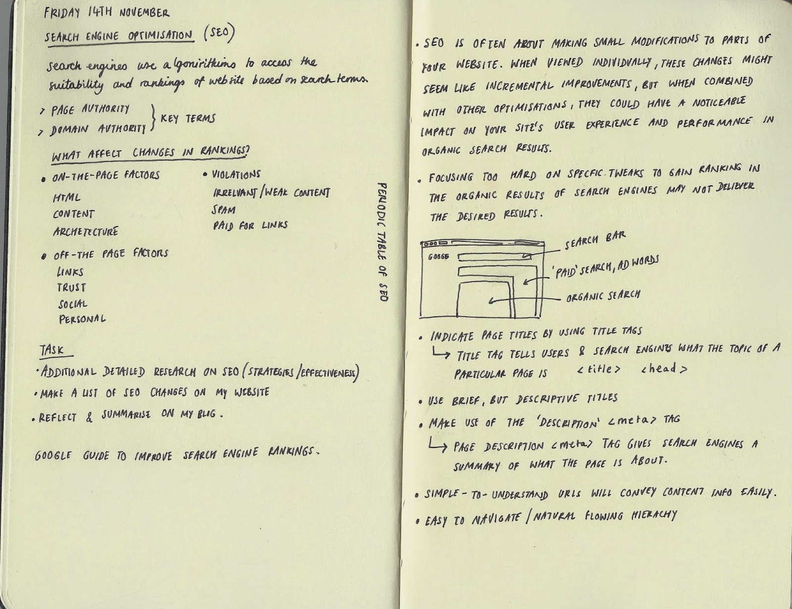
Study Task 09: Search Engine Optimisation (SEO)


Search Engine Optimisation 

Search engines use algorithms to access the suitability and rankings of a website based on search terms. 

Search Engine Optimisation is a way of making alterations  to websites according to the criteria that search engines use when ‘crawling’ web content. ‘Page Authority’ refers to how likely a web page will be ranked in a search based on SEO optimisation, internal linking and content relevance. ‘Domain Authority’ refers to how likely a domain will be ranked in a search based on age, popularity and size. 

What affects changes in rankings? 
  • on-the-page factors - HTML, content and architecture
  • off-the-page factors - links, trust, social, personal
  • violations - irrelevant/weak content

Search engine optimisation is often about making small modifications to parts of your website. When viewed individually, these changes might seem like incremental improvements, but when combined with other optimisations, they could have a noticeable impact on your sites user experience and performance in organic search results 

Focusing too hard on specific tweaks to gain ranking in the organic results of search engines may not deliver the desired results.

Indicate page titles by using title tages - title tags tells users and search engines what the topic of a particular page is <title> <head> use brief but descriptive titles/ 

Make use of the 'description <meta> tag gives search engines a summary of what the page is about. Simple-to-understand URLS will convey content information easily.

URL parts can be removed - a user doesn't have to put the whole lot in, so prepare for a cut down version

Prepare two sitemaps, one for users and one for search engines. Lowercase sitemap is a simple page which displays the structure.

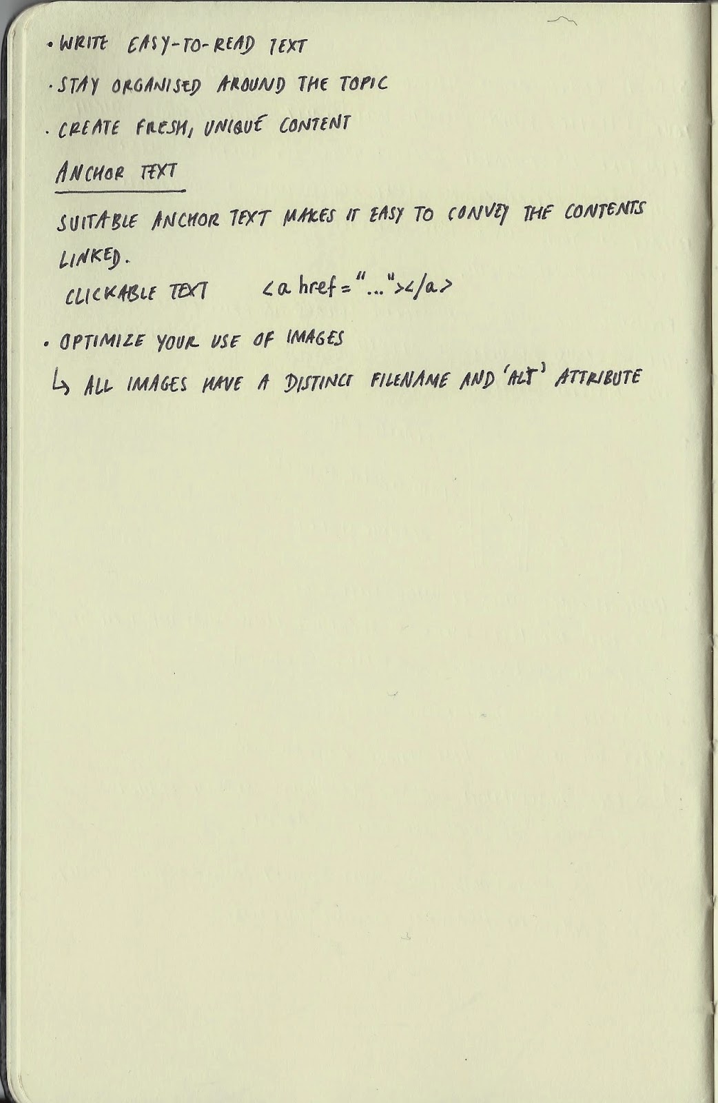
Easy to navigate/natural flowing hierarchy. Stay organised around the topic, create fresh, unique content.

Anchor Text - suitable anchor text makes it easy to convey the contents linked. Use clickable text <a href="..."></a>

Optimise your use of images - all images have a distinct filename and 'alt' attribute. 

Possible Changes to my website to help optimisation 
  • create <title> tags for each particular topic of the page, for example 'sacred geometry' and 'orion mystery' 
  • create a description <meta> tag which will give a summary of what the page is about on a search engine
  • make sure all my image have a distinct filename and 'alt' attribute. 
  • I think my website already has a easy to navigate/natural flowing hierarchy as it is for meant to inform and educate. 


Responsive: Feathr.com


Feathr.  Verb.  [feth-rr]
To make art and not decoration.
'Our mission is to fill the world with more art and less decoration. We’re for everyone who loves art and has a house with walls. So here’s to more good shit and less shit shit.'
This morning we had Tom visit us from Feathr, based in Helsinki, London and Bali, for a wallpaper briefing. He wants us to design a wallpaper which has a concept and tells a story. 

subversion + the freedom of a tight brief + the canvas 

Timorous Beasties

Timourous Beasties was established in Glasgow in 1990 by Alistar McCauley and Paul Simmons, who met studying textile design at Glashow school of art. Today the studio is a diverse operation and has emerged as a multi-award winning, internationally acclaimed icon. Below are some wallpapers I especially liked. 


Thursday, 13 November 2014

Responsive: SMART

Specific - Details exactly what needs to be done
Measurable - Achievements can be measured in terms of units or specific success criteria
Achievable - That resources, scope and scale are within your capabilities or capacity
Realistic - The objectives are possible to attain - which is important for your motivation
Time Bound - The period of time, target dates, schedule or timetable is clearly defined.

Tuesday, 11 November 2014

Website: Homepage Changes

try this link GIF

I've created this moving gif to represent  that every time you reload the page a different photograph representing sacred geometry appears. Apologies that the quality of the image is not great. 

I have also changed the font to Ostrich, as I felt Baskerville being a serif font does not represent geometry.  


in context